Roles: Lead UX Designer, Quality Assurance
To comply with my non-disclosure agreement, I have omitted confidential information.
Problem
Salespeople needed a tool to sell a life-saving piece of equipment to emergency room staff. It wasn’t feasible to drag the piece of equipment around to demonstrate due to the size of the equipment. Creating an app that demonstrated the device on an iPad solved many problems.
- The demonstrations were error-proof, making it easy for the Salesperson to focus on the key talking points.
- The application didn’t need internet.
- There were helpful notes baked into the application.
- The main protocols for using the machine were automated.
- The application had all of the information the Salesperson needed.
It was an incredible opportunity to work on this project, as the device was a life-saving tool. The core function of the device was to lower, raise, and essentially control the patient’s temperature to within 0.5 degrees. This is helpful in situations where patients may have suffered from a stroke, heart attack, or even a fall into a frozen lake. The patient’s temperature could be raised slowly, or lowered to slow down trauma to the body. It also had 150 other use cases.
Team
- Lead UX Designer
- Art Director
- Copy Writer
- UI Designer
- 2 app developers
Paint Points
My first task was to interview the stakeholders to determine the best delivery of the demonstration, as well as the key selling points.
- Demo devices were too expensive to create, as well as cumbersome.
- There was a tight deadline because the semi-annual sales meeting was quickly approaching.
- The machine was amid major improvements that included the interface, I didn’t have a manual to follow.
Client Provided Materials
- Brochure for the device
- Product comparison of competing and similar devices
- Videos demonstrating the product
- Presentation on the device including talking points for salespeople
- Illustrator files used to design the interface of the latest version of the device
Research
I would have loved to do a competitive and contextual audit of how other companies were selling their devices, but unfortunately, I didn’t have the data, budget, or time. What I did have the opportunity to conduct was: interviews, a workshop, and an actual device sitting in my cube.
Interview Summary
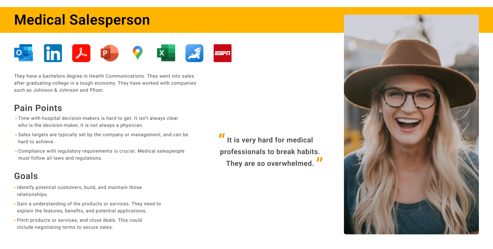
I had the opportunity to conduct interviews with two salespeople and two stakeholders. The major outcome of the interviews was that every salesperson has a company-provided iPad. The interviews also provided information to create personas. A local application could demonstrate the machine without continuous wifi or internet. It was also ideal because the salespeople carried the iPad wherever they went. This also gave us more time to work on the application as the delivery method for the app was already installed on the salespeople’s devices.
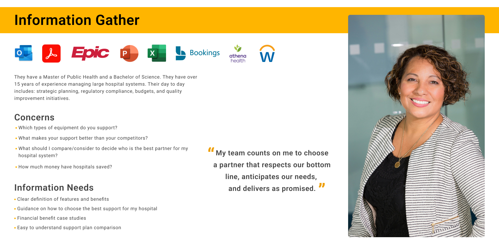
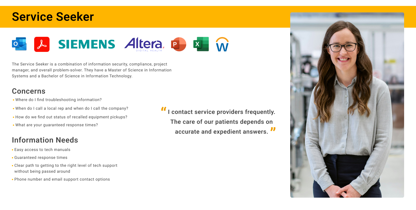
The client and subject matter expert and I both agreed that three personas were necessary for this experience. Between their knowledge, and the interviews I was able to create them. My top priority was the Medical Salesperson as they were the primary user.
Workshop
To prepare for the project, I spent hours watching videos recorded with a smartphone by one of the stakeholders. The video demonstrated how the machine works. The machine’s functionality was simulated, as we didn’t have a patient to run the machine on. Using screenshots from this video, I started to piece together flows, which I glued on several large foam boards and brought to a workshop with stakeholders. In the workshop, we refined and prioritized these flows for two hours.
Device Audit
The intricate screens of the app required extreme attention to detail. Each screen of the machine was documented and the options, buttons, and functions were detailed. Since there was no manual, I had to rely on a prototype of the device. I met with my subject matter expert three different times to nail down the functionality of the machine.
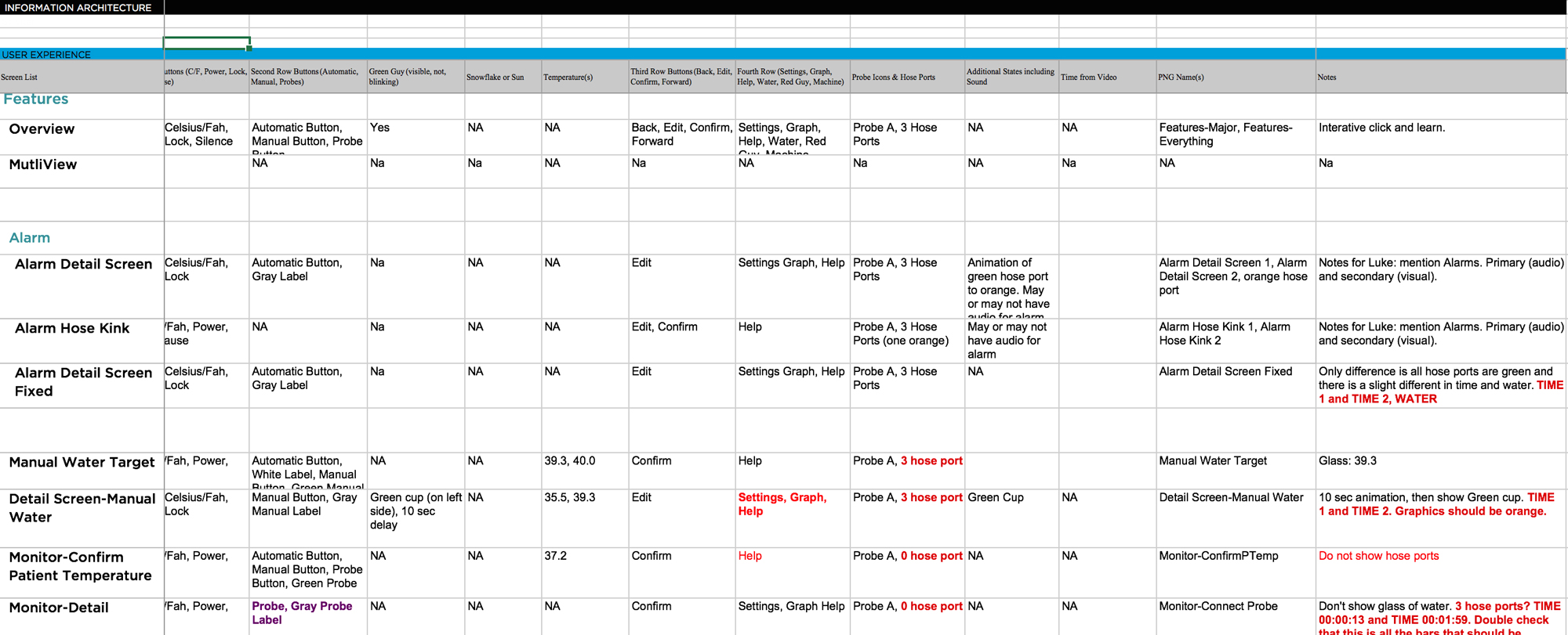
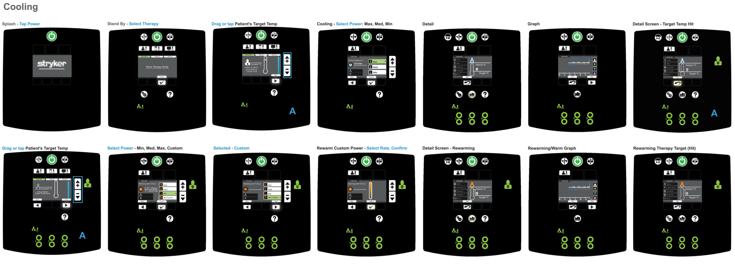
Wireframes and Prototype
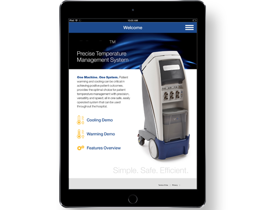
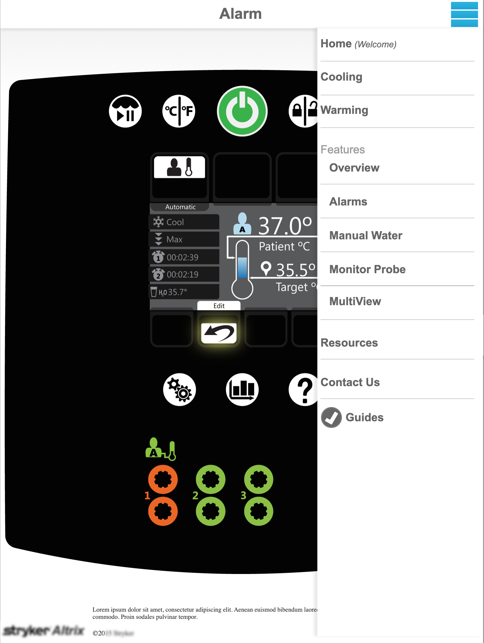
I developed five flows, one of which was an alarm scenario. Each flow was wired and prototyped. This is a short example of the flows and screens.
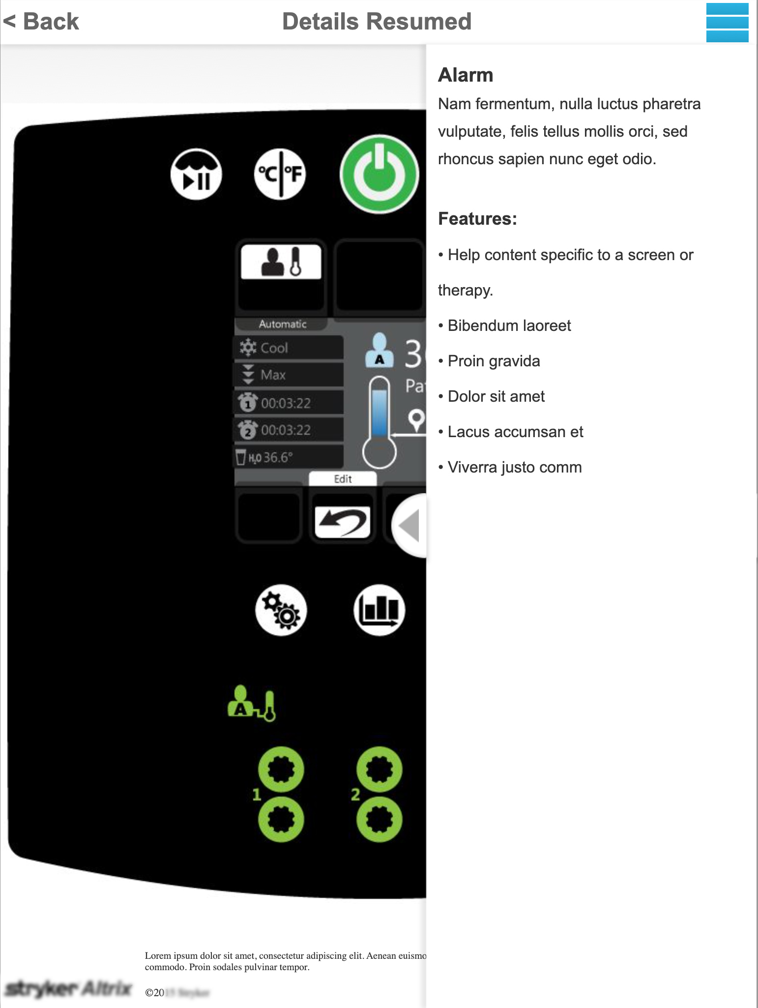
Highlighting the Benefits
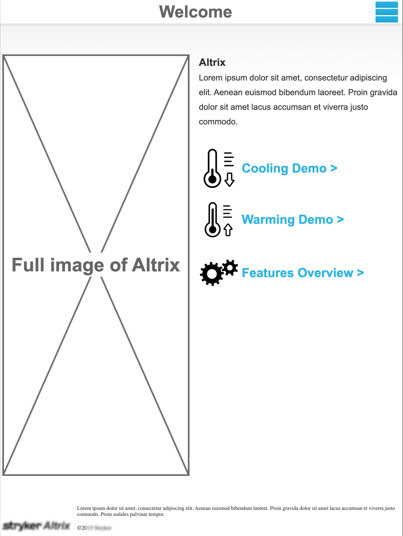
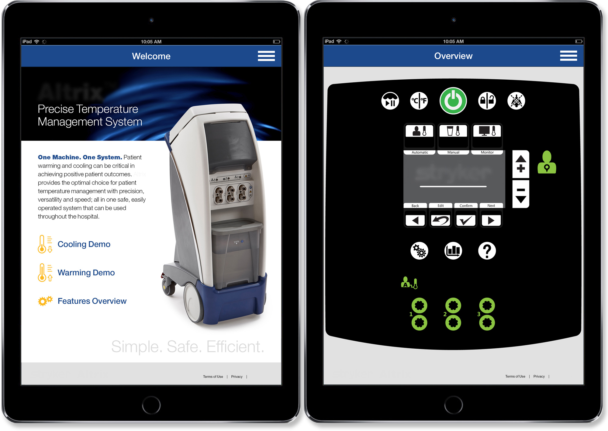
In addition to the practical details of the flows and how the machine worked, I had to think of the salesperson and the hospital decision-makers. With the help of the Art Director, we brainstormed how to deliver the experience. We decided on a home screen that focused on the two most important flows, with access to the other flows under the label “Features Overview”. We knew from the interviews that time with hospital decision-makers was very limited.
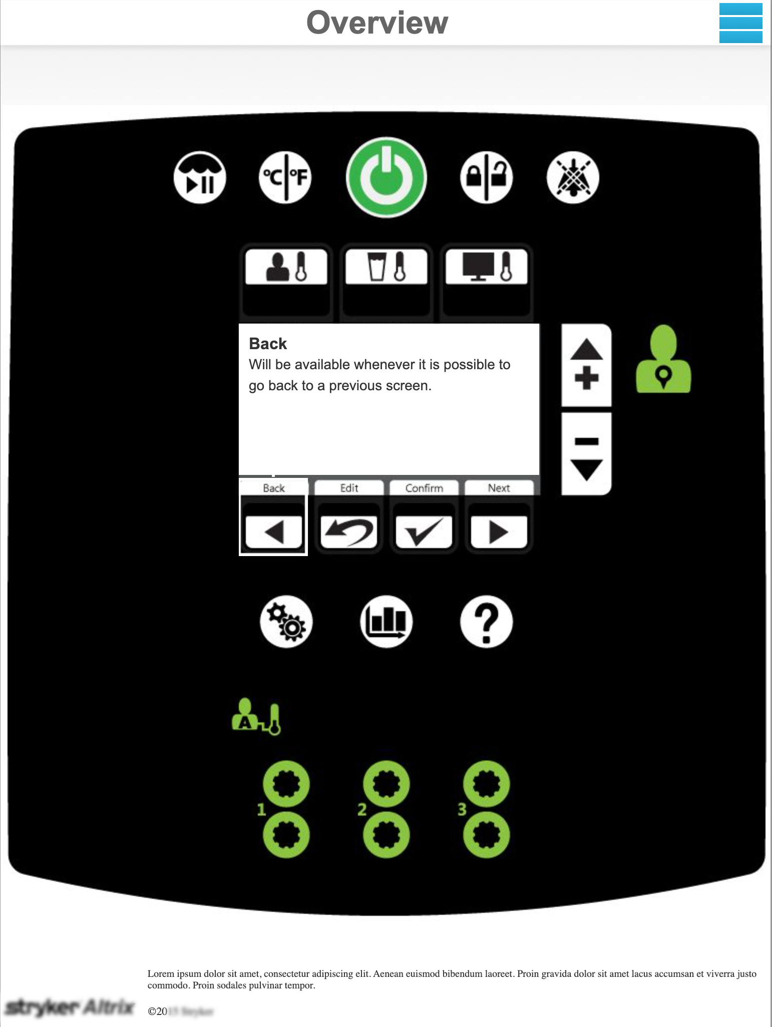
Tapping on either one of the demos allowed the user to experience how to cool or warm a patient. They were able to experience a very real demonstration of how easy the device was to use within their environment. I designed the experience to be as realistic as possible, even using the Illustrator files that were used to create the device’s screens.
Within each screen, key talking points were provided for the salesperson. A tap revealed a side sheet explaining the benefits at each contextually relevant moment. The talking points were excellent guidance on selling the benefits of the device. The client was insistent on portrait orientation for the application because it mimicked the screen of the device so well. I was hesitant in the beginning but after experiencing the app in the end it was a good decision.
Quality Assurance
I assisted with Quality Assurance since the machine’s functions are so intricate. I was the only one who could double-check the intricacies of the screens, as no manual had ever been written by the engineers. I ran the demo machine over and over, hoping that it was close enough to the engineer’s intentions. In the end, the engineers of the product were so impressed with my interaction design document they said they were going to use it as the manual.
Outcome
The best way to measure a project is when the company asks for another project. The strategy created for this app was also easy to transfer to a site that could be sent to hospital decision-makers with a link and a password.
Learn more about the product, Altrix Precision temperature management >

Communication and Cyber Security Platform
An American and Canadian defense company needed to unite various products and services that ranged from hand-held radios for soldiers, to solutions that were “don’t ask, don’t tell”.

Content Management Platform for Medical Devices
A global medical device company needed a platform that could unite over 20 business units. It was easily a year-long project squeezed into four months.